Brand kit · Version 1.1 · 16 May 2026
How Digi2L
looks. Sounds.
Behaves.
A working brand kit for OEM partners, resellers, logistics partners, press, and our own team. Use it as a reference, download what you need, and reach out if something's missing.
01 · The Digi2L story
Every appliance is too valuable, and too consequential to the planet, to be lost to the scrap dealer.
Mission
Give every appliance a fair, dignified second life.
Positioning
The trusted, transparent way to sell, exchange, and buy premium home appliances — backed by AI valuation, doorstep logistics, and a brand-partner network.
Promise
Fair value. Frictionless. First time.
02 · Logo system
The wordmark is the brand.
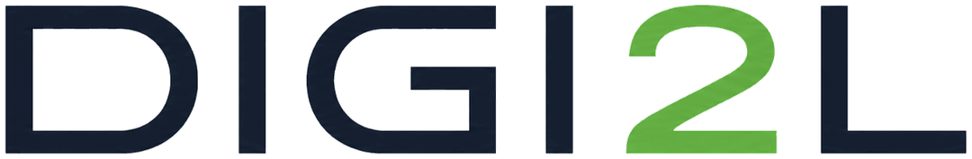
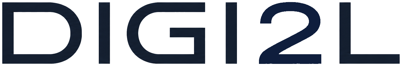
The Digi2L logo is a custom wordmark. DIGI and L are set in Midnight Navy. The 2 — the pivot, the moment of transformation — is set in Voltage Green. This split is the only color treatment the logo ever takes.
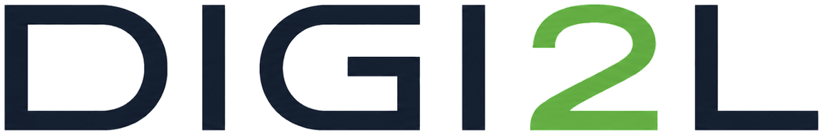
Primary wordmark
Default. Light backgrounds.
Reverse wordmark
Dark backgrounds, photos.
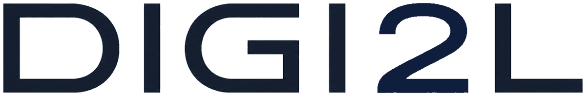
Mono navy
Single-colour: foil, watermark, mono print.
Mono white
Knockout on full-bleed photography.
Clear space
Always leave clear space around the logo equal to the height of the letter D stem. Nothing — text, image, or rule — enters this zone.
Minimum size
Below these thresholds the wordmark stops reading. Use the icon roundel instead.
- Web / app header80 px wide
- Favicon / app icon (roundel)24 px wide
- Print20 mm wide
Logo misuse
Don't recolour the 2 — it is always Voltage Green
Don't stretch, condense, rotate, or warp the wordmark
Don't apply gradients to the wordmark itself
Don't add a fixed tagline lockup under the wordmark
Don't place on busy photography without a navy or white scrim
Don't use the older arrow-ring Digi2L graphic — it's deprecated
03 · Color
Two brand colours. Used with discipline.
The palette is intentionally narrow. Midnight Navy carries the substance; Voltage Green carries the moment. Everything else is a neutral or a semantic signal. Both brand colours were measured directly from the wordmark artwork — they are not approximations.
The 60–30–10 rule
Hold every page to roughly:
- 60 % neutrals — background, white surfaces, mist
- 30 % Midnight Navy — type, nav, footer, primary surfaces
- 10 % brand green — Voltage Green for ≥40 px hero decoration; Forest Press for the one primary CTA per fold + success
Voltage Green is a brand-identity colour, not an interactive colour.
Voltage Green #5DAE3E scores only 2.8:1 against white — below WCAG's 3:1 floor for graphical UI contrast, and below 4.5:1 for body text. Use it on the wordmark, swatches, and decorative type ≥40 px. For every interactive use — CTAs, focus rings, links, success ticks — use Forest Press #3F8E2C (4.1:1, passes AA Large + 1.4.11 graphical UI). The visual difference is small enough that users perceive them as the same brand green, but the contrast difference is the difference between a brand that ships and a brand that fails an accessibility audit.
04 · Typography
Inter for the headlines. Manrope for the prose.
Both faces are free on Google Fonts. The pair is intentional — Inter carries the geometric authority of the wordmark; Manrope adds warmth in long-form. Don't substitute, don't mix the roles.
Inter
Display · weights 700 / 800 / 900
Aa Bb 0123
The fair price for your fridge.
Tabular numerics for prices: ₹8,400 · ₹12,250 · ₹37,900
Manrope
Body · weights 400 / 500 / 600
Aa Bb 0123
Digi2L gives every appliance a dignified second life — sell it, exchange it, or buy one that already had one. Fair price, doorstep pickup, instant payment.
Caption · meta · helper text · timestamps. Manrope at 14 px stays legible without competing with body copy.
Display
40 → 96 px
weight 900
Hero only
H1
32 → 56 px
weight 800
Page heroes
H2
28 → 40 px
weight 700
Sections
Body
16 px
weight 400
Default
05 · Voice & tone
A friend who happens to know the resale price of your fridge.
Confident, plain-spoken, useful. We are a national brand, not a polished one. Three rules:
01
Lead with the number.
Your Samsung 253L fridge: ₹8,400. Then explain.
02
Use the words a friend uses.
Pickup, not reverse logistics. Fair price, not competitive valuation.
03
Don't apologise for being a business.
No we humbly request. Say tell us your address.
Microcopy in practice
Your old appliance is worth more than you think.
The curated lifecycle.
Get my price
Start selling
Shop certified appliances
Explore Smart Buy
Partnered with
Trusted by global tech leaders
Done. We're on the way.
Your request has been submitted.
No orders yet. Want to sell something?
There are currently no items to display.
Mini glossary
Sell
not Dispose / dispense
Fair price
not Best price / unbeatable price
Pickup
not Reverse logistics / dispatch
Quality Check (QC)
not Inspection / audit
Trade-in
not Buyback (except for the product Assured Buyback)
Smart Buy
not Refurb / pre-owned
06 · Co-branding
When you're running an exchange with us.
For OEMs, resellers, logistics partners, and media: how to show the Digi2L wordmark next to yours, in copy and in print.
In layout
- Use the primary wordmark on light backgrounds, reverse on dark.
- Lock up side-by-side with a 1× D-stem vertical rule, equal optical weight.
- Never make the Digi2L wordmark smaller than 50 % of your own — we are an equal partner.
- Never imply endorsement we haven't given in writing.
In copy
- "In partnership with Digi2L"
- "Exchange your old appliance with Digi2L"
- "Powered by Digi2L" — we are a brand, not infrastructure.
- "A Digi2L company" — UTC Digital is the parent.
In press
First reference: "Digi2L, a UTC Digital brand and India's first digital platform for used home appliances." Subsequent references: "Digi2L." Never "the Digi2L platform."
07 · Downloads
Take what you need.
High-resolution raster PNGs of every wordmark variant, plus the app icon roundel at every common size. Vector SVG ships in the next release.
Wordmark
Primary wordmark
Navy DIGI+L, green 2 · light backgrounds
Reverse wordmark
White DIGI+L, green 2 · dark backgrounds
Mono navy
Single colour · foil, watermark, mono print
Mono white
Single colour · knockout on full-bleed photos
App icon · site favicon
The SVG used as the browser-tab favicon at digi2l.co.in. A circular recycling-arrow stroke wrapping the “D2L” monogram, in a green-blue-deep-green gradient. Scales cleanly to any tab size because it's a vector; OS launchers letterbox or pad to a square as needed.
Full brand kit as PDF
An 8-page partner-ready PDF of everything on this page. Regenerated before each release that touches the brand.